How Two Circles Became a Brand: The Story Behind the EKKO Logo
Ekko
When I first started working on EKKO, I wasn’t thinking about logos or colour palettes or brand identity. I was just trying to solve a real problem I kept seeing in clinics: patients leave the consultation room, go home, and suddenly realise they don’t remember half of what was said. The front desk gets flooded with calls. Staff juggle WhatsApp, paper notes, and emails. Doctors get questions that were already answered once.
EKKO grew out of that gap — that moment when instructions “echo” in a patient’s mind, and clarity either strengthens… or disappears.
But once we had a functioning product, it became clear that we needed an identity that actually reflected what EKKO stands for. Something clean, modern, and calm. Something that felt like Slincas Technologies, but also stood on its own.
That’s where this story begins.
The Slincas Identity: A Foundation Before the Product
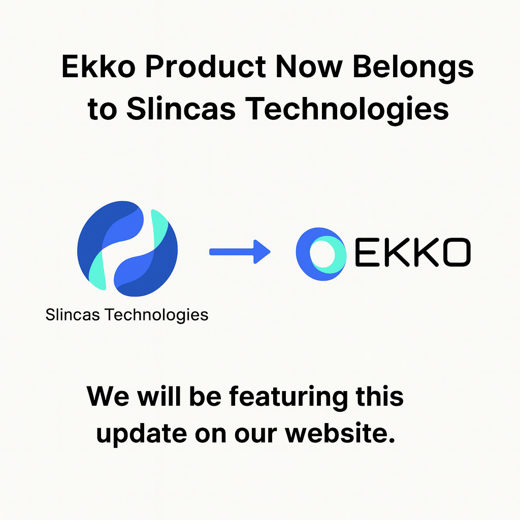
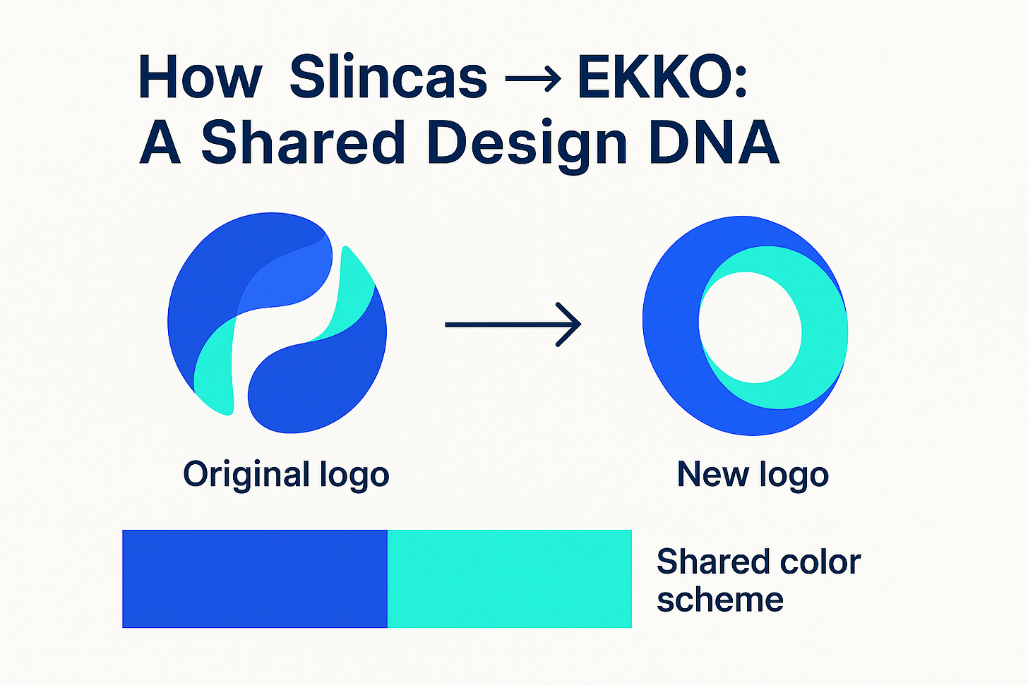
Before EKKO existed, we built the Slincas Technologies identity. The name was illustrative of a “S”ecure “L”inked “C”ommunication “S”ystem. The Slincas mark was shaped around movement — curved forms, a sense of flow, and a blend of blue and aqua. It wasn’t a literal “S,” but it had structure and softness at the same time.
That mark eventually became the parent identity for everything we created afterwards. So when it came time to design EKKO’s logo, I knew two things:
It shouldn’t look unrelated to Slincas.
But it shouldn’t feel like a copy-paste child logo either.
EKKO needed to feel like an extension — a continuation of the same visual language — but with its own purpose.
And because the whole concept of EKKO is built on clarity, recall, and continuity, the “echo” idea kept coming back. Circles. Loops. Repetition. A message that stays with you.
Bringing EKKO to Life: The Fiverr Chapter